- Featured article
- People at Skills360 25 - March 2025 | 10 min read


For graphic designers, color palettes aren’t merely for adding aesthetics, they play a role much bigger than that. Colors can invoke emotions, convey messages and even influence decisions, all without using any words. Don’t believe me? Think of bold Yellow and Red hues, and feel your mouth melt. This is what color psychology is.
Research shows that up to 90% of snap judgments about a product are based on its color alone. This means that the colors you choose for your designs can make or break their effectiveness. Whether you’re designing a logo, a website, or a marketing campaign, your color palette will play a huge role in how your work is perceived by your audience.
At Skills360, we recommend our designers to study color psychology in order to create bespoke designs that stand out.
Color psychology is when certain colors influence your brain to process visual information. According to it, different wavelengths of light stimulate your eyes and trigger emotional and physiological responses. In our graphic designing course at Skills360, here is a color psychology guideline we provide our students:
Now that you know which color represents what, how do you choose the right palette for your design? Here are some Skills360 special tips for that:
Color palettes should reflect a brand’s personality and values. Are you designing for a playful and energetic brand, or a serious and professional one? Understand the brand’s identity and choose colors that align with it.
Different demographics respond to colors differently. For example, younger audiences like toddlers are likely to be drawn to bright, vibrant colors, while millennials are more attracted towards beige and whites. Read into your target audience’s preferences and cultural associations to make sure they connect with your palette.
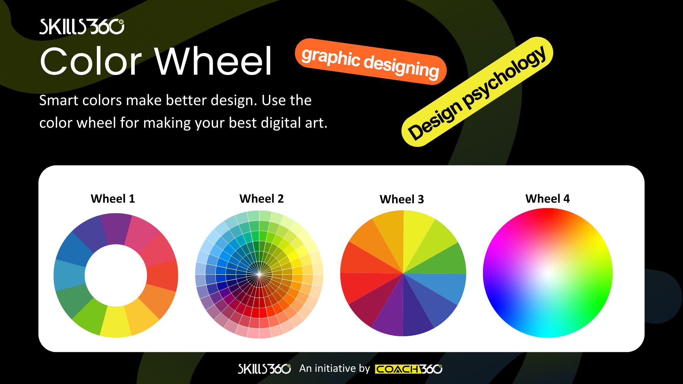
Color harmonies are combinations of colors that are visually pleasing. Some common harmonies include complementary (colors opposite each other on the color wheel), analogous (colors next to each other), and triadic (three colors evenly spaced). Experiment with these harmonies to create a balanced and cohesive palette.
A beautiful color palette is useless if it’s not accessible. Make sure your design is inclusive by checking the contrast between colors, especially for text and background. Tools like WebAIM’s Contrast Checker can help you determine if your palette meets accessibility standards.
Although it’s important to stay true to a brand’s identity, you can also draw inspiration from current trends. Pantone’s Color of the Year, for example, often influences design trends across industries. This year’s color of the year is Mocha Mousse.
When it comes to color palettes, less is often more. We recommend sticking to 2-4 main colors to avoid overwhelming your audience. Use the 60-30-10 rule to create a balance where 60% is dominant color, 30% is secondary color, and 10% is accent color.
As a graphic designer, your choice of colors can make or break your design. By understanding the psychology of colors and their impact on emotions and decisions, you can create palettes that not only look stunning but also communicate the brand’s message effectively. To learn more about color psychology and how it can influence your designs, join our graphic designing course at Skills360. This 12-week course will not only make you a pro at designing, but influencing minds too!


Get curated emails on out of class learning and work on your skills on your free time.